Why Dark Mode Matters
Reduces eye strain in low light.
Preserves battery on OLED screens.
User preference for many.
Modern app expectation.
Not Just Inversion
Pure black on white → pure white on black = ugly.
Colors need adjustment.
Contrast ratios different.
Shadows don’t work same way.
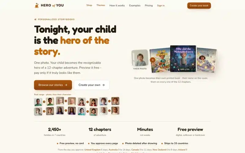 From our workProduct design people finishIn Hero of You a parent goes from a photo of their child to a printed book in one order.Product design →
Background Colors
Not pure black (#000).
Slightly off-black: #121212 typical.
Slightly warmer or cooler based on brand.
Elevate surfaces with slightly lighter shades.
Text Colors
Not pure white (#FFF): too harsh.
Off-white: #E0E0E0 or similar.
Different levels: primary, secondary, disabled.
Legibility over aesthetics.
Brand Colors in Dark Mode
Bright saturated colors: too intense.
Desaturate 10-20%.
Test contrast against dark background.
May need adjusted brand palette.
Semantic Colors
Errors: adjusted red.
Success: adjusted green.
Warnings: adjusted yellow.
Info: adjusted blue.
All slightly muted for dark mode.
Elevation and Shadows
Shadows less visible in dark mode.
Use surface elevation: lighter backgrounds for elevated elements.
Borders more prominent.
Depth harder to convey.
Images and Media
Images may need adjustment.
White backgrounds jarring.
Consider dark mode-specific illustrations.
Videos – transparent backgrounds tricky.
Icons
Line icons work in both modes.
Filled icons may need color adjustment.
Consistent style regardless of mode.
System vs Manual
Follow system default best UX.
Also allow manual override.
Remember preference per user.
Time-based auto-switching optional.
Testing Dark Mode
Not just switching once.
Every screen tested.
Various lighting conditions.
Users with vision differences.
Common Mistakes
Pure black backgrounds.
Pure white text.
Same colors as light mode.
Not testing accessibility.
Ignoring embedded content (iframes, images).
Implementation
CSS custom properties for theming.
Prefers-color-scheme media query.
Local storage for user preference.
Class-based switching for JS override.
Accessibility
Contrast ratios: WCAG AA minimum.
Test with actual users.
Some visual impairments prefer light mode.
Always allow user choice.
Based on Real Projects
This guide is based on our work with:
Further Reading
If this guide helped you, you might also want to read our comprehensive guide on UI/UX Design.
Want to talk about your project?
A free consultation call, no commitment.
רוצים לדבר על הפרויקט שלכם?
אנחנו מתמחים בפיתוח SaaS, פתרונות AI, עיצוב UX/UI ובניית אתרים. ספרו לנו מה אתם צריכים.
דברו איתנו ←