What Design System Actually Is
Not just a Figma library.
Living system: tokens, components, patterns, guidelines, code.
Shared language between design and engineering.
When to Build One
Multiple designers or developers on team.
Product with 20+ screens.
Multiple products under one brand.
Consistency issues emerging.
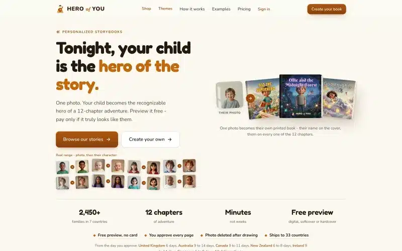 From our workProduct design people finishIn Hero of You a parent goes from a photo of their child to a printed book in one order.Product design →
When NOT to Build
Solo designer, MVP stage.
Product still finding form.
Small product with 5-10 screens.
Over-engineering signal.
Design Tokens – The Foundation
Colors: primary, secondary, semantic (success, error, warning).
Spacing: 4px base, then 8, 16, 24, 32, etc.
Typography: font sizes, weights, line heights.
Borders, shadows, animations.
Stored as variables: –color-primary, –spacing-md.
Component Hierarchy
Atoms: buttons, inputs, labels.
Molecules: form fields (label + input + help text).
Organisms: forms, headers, cards.
Templates: page layouts.
Pages: full designs.
Building Components in Figma
Use auto layout for all components.
Variants for states: default, hover, active, disabled.
Properties for customization: label text, icon, size.
Boolean properties: show/hide icon, enable/disable elements.
Documentation
Each component needs:
Visual example.
Usage rules: when to use, when not.
Props/variants explanation.
Accessibility notes.
Code example.
Storybook for Engineering
Interactive component library.
Live examples with all states.
Documentation next to code.
Testing ground for new components.
Naming Conventions
Consistent naming across design and code.
Buttons: Primary, Secondary, Tertiary, Ghost.
Not: Btn1, Btn2 (unclear) or PurpleButton (too specific).
Semantic > visual.
Color Systems
Primary: brand color.
Neutral: grays for text, backgrounds.
Semantic: success (green), error (red), warning (yellow), info (blue).
Each color: 50-900 shades (Tailwind style).
Typography System
Font families: 1-2 max.
Sizes: 8-10 scale points.
Line heights: relative to size.
Weights: 2-3 (regular, medium, bold).
Semantic: display-1, heading-1, body-1, caption.
Spacing Scale
Base unit: 4px or 8px.
Progressive: 4, 8, 12, 16, 24, 32, 48, 64.
Named: xs, sm, md, lg, xl (or numeric).
Consistency: never arbitrary values.
Iconography
Consistent style: filled or outlined, choose one.
Size scale: 16, 20, 24 (or your grid).
Set: 50-100 icons cover most needs.
Source: Lucide, Heroicons, or custom.
Governance
Who can add/change components?
Review process for new components.
Deprecation strategy for old ones.
Documentation for how to contribute.
Version Control
Figma: version history built-in.
Code: semantic versioning for design system package.
Breaking changes = major version bump.
Rollout Strategy
Don’t rebuild everything at once.
Start with new features using design system.
Migrate existing screens over time.
Deprecate old components gradually.
Measuring Success
Design consistency: less variation across screens.
Development speed: faster to build new features.
Onboarding: new team members contribute faster.
Handoff friction: fewer questions from engineers.
Based on Real Projects
This guide is based on our work with:
Further Reading
If this guide helped you, you might also want to read our comprehensive guide on UI/UX Design.
Want to talk about your project?
A free consultation call, no commitment.
רוצים לדבר על הפרויקט שלכם?
אנחנו מתמחים בפיתוח SaaS, פתרונות AI, עיצוב UX/UI ובניית אתרים. ספרו לנו מה אתם צריכים.
דברו איתנו ←