What Are Micro-interactions
Small, functional animations providing feedback.
Button hover state. Form field focus. Loading spinner. Success checkmark.
Individually small. Cumulatively: makes app feel alive.
Why They Matter
Perceived responsiveness > actual speed.
Communicates system state.
Delights users. Creates emotional connection.
Guides attention.
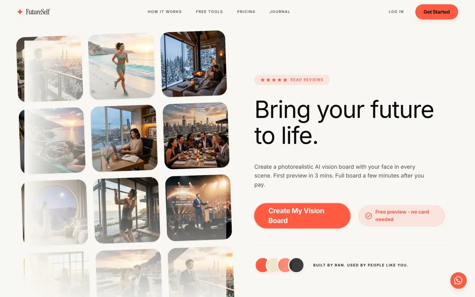 From our workA first product live in 4 weeksSign-up, payments and the core feature, ready for real users. FutureSelf is one of the products we built.How it works →
Timing Is Everything
Too fast (under 100ms): user doesn’t perceive.
Too slow (over 400ms): feels sluggish.
Sweet spot: 200-300ms for most interactions.
Complex movement: up to 500ms OK.
Easing Curves
Linear: robotic, avoid.
Ease-in: acceleration. For exiting elements.
Ease-out: deceleration. For entering elements (most common).
Ease-in-out: for movement between two points.
Cubic-bezier for custom feels.
Button States
Default → Hover: subtle color/shadow change (100-200ms).
Hover → Active (pressed): slight scale down or darker (100ms).
Active → Success: color change + optional icon (300ms).
Never: instant hard changes. Always ease.
Form Interactions
Field focus: border color changes, label lifts.
Field validation: real-time feedback as user types.
Error state: gentle shake, red border, error message slides in.
Success: green checkmark fades in, error message removes.
Loading States
Instant action (under 100ms): no loading needed.
Fast (100-300ms): fade in new content.
Medium (300ms-2s): spinner or progress indicator.
Long (2s+): skeleton screens or explicit progress bar.
Skeleton Screens
Show layout with gray placeholders.
Content fills in as it loads.
Feels 3x faster than spinner.
Preserves layout – no shift when content loads.
Transitions Between States
Login form → success: form fades out, welcome message fades in.
Page navigation: subtle fade or slide.
Modal opens: overlay fades in, modal slides up.
Item deletion: item fades out and list reflows smoothly.
Attention-Grabbing (Sparingly)
Pulse: draws attention without being annoying.
Shake: for errors, use once, brief.
Bounce: for success, feel playful.
Overuse: annoying. Use for critical moments only.
Delight Moments
Confetti for major achievements.
Custom animations for empty states.
Hidden Easter eggs (developer tools, unusual clicks).
Personality where appropriate.
Accessibility Considerations
Prefers-reduced-motion CSS: some users have motion sensitivity.
Detect and disable animations for them.
Focus indicators: don’t rely only on animation.
Sound alternatives: don’t require visual attention only.
Performance
Use CSS transforms (translate, scale) – GPU accelerated.
Avoid animating layout properties (width, height, top) – reflows slow.
WillChange property: hint browser to optimize.
Test on low-end devices.
Tools
CSS: for simple transitions.
Framer Motion: React animations.
GSAP: complex animations.
Lottie: complex illustrations from After Effects.
Testing Micro-interactions
Show designs with and without to users.
Measure: task completion time, satisfaction.
Iterate: 3-5 iterations to find right feel.
Our Approach
Every product interaction gets consideration.
Not overdoing. Restraint is key.
Consistency: same interactions feel same everywhere.
Purpose: every animation has reason. No decoration only.
Based on Real Projects
This guide is based on our work with:
Further Reading
If this guide helped you, you might also want to read our comprehensive guide on UI/UX Design.
Want to talk about your project?
A free consultation call, no commitment.
רוצים לדבר על הפרויקט שלכם?
אנחנו מתמחים בפיתוח SaaS, פתרונות AI, עיצוב UX/UI ובניית אתרים. ספרו לנו מה אתם צריכים.
דברו איתנו ←