The Real Meaning
Design for mobile constraints first.
Add features/complexity for larger screens.
Not just responsive – fundamental approach.
Forces focus on essentials.
Why It Matters
Mobile is majority traffic for most B2C.
B2B growing on mobile too.
Constraints force better decisions.
Mobile-optimized often works great on desktop.
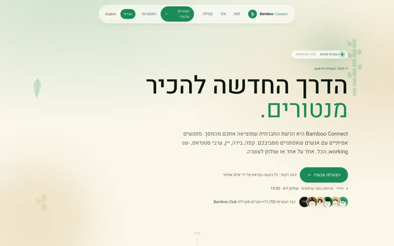 From our workOne app for iOS and AndroidBamboo Connect shipped to the App Store and Google Play from one codebase.Build your app →
Content Hierarchy
What’s the ONE thing user needs?
Progressive disclosure.
Above the fold: essential.
Below: supporting info.
Touch Targets
Minimum 44×44 pixels (Apple).
Ideally 48-60 pixels.
Adequate spacing between.
Larger for primary actions.
Navigation Patterns
Bottom tab bar: 3-5 primary destinations.
Hamburger menu: acceptable but hides.
Contextual: relevant to current screen.
Simple > complex.
Typography for Mobile
Base size: 16px minimum (browser zoom triggers below).
Line height: 1.4-1.6.
Line length: 45-75 characters.
Sufficient contrast.
Forms on Mobile
Single column always.
Right input type: email, tel, number.
Autofill enabled.
Show/hide password toggle.
Progressive: multi-step better than long.
Images on Mobile
Optimize file size aggressively.
WebP format.
Responsive images: correct size per device.
Lazy load below fold.
Loading States
Users on mobile networks – slower.
Skeleton screens over spinners.
Progress indicators for long operations.
Offline states considered.
Gestures
Swipe for common actions.
Pull to refresh where appropriate.
Long press for contextual menu.
Standard gestures over custom.
Performance
Under 2s load time on 4G.
Minimize JavaScript.
Critical CSS inline.
Aggressive caching.
Testing
Real devices, not just emulators.
Various sizes: 320px to tablet.
Different orientations.
Real network conditions.
Common Mistakes
Desktop-first then adapted.
Small tap targets.
Text too small.
Modals covering whole screen.
Missing keyboard consideration.
Beyond Mobile
Wearables next frontier.
Voice interfaces growing.
AR/VR requires new thinking.
Mobile-first thinking transfers.
Based on Real Projects
This guide is based on our work with:
Further Reading
If this guide helped you, you might also want to read our comprehensive guide on UI/UX Design.
Want to talk about your project?
A free consultation call, no commitment.
רוצים לדבר על הפרויקט שלכם?
אנחנו מתמחים בפיתוח SaaS, פתרונות AI, עיצוב UX/UI ובניית אתרים. ספרו לנו מה אתם צריכים.
דברו איתנו ←