Who Uses Dashboards
Different roles: exec, manager, individual contributor.
Different needs each.
Not: same dashboard for everyone.
The Purpose Question
What decision does this dashboard support?
What action follows viewing it?
If no action – not needed.
Every metric ties to action.
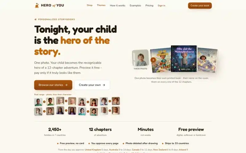 From our workProduct design people finishIn Hero of You a parent goes from a photo of their child to a printed book in one order.Product design →
Information Hierarchy
Most important: largest, top.
Secondary: smaller, below or right.
Tertiary: only on drill-down.
Not: everything equal size.
Above the Fold
Key metrics only.
3-5 max.
At a glance understanding.
Rest of dashboard for depth.
Chart Selection
Line: trends over time.
Bar: comparison.
Pie: percentages of whole (rarely needed).
Number: single value.
Table: detailed data.
Match chart to question.
Reading Order
Left to right, top to bottom (LTR languages).
Right to left for Hebrew/Arabic.
Follow eye path.
Not: random arrangement.
Color Meaning
Red: bad, warning.
Green: good, growth.
Yellow: neutral or warning.
Blue: informational.
Consistent across dashboard.
Numbers Formatting
Large numbers: 1.2M not 1200000.
Currency: symbol and thousands separators.
Percentages: appropriate decimal places.
Dates: consistent format.
Filters and Time Ranges
Common: last 7 days, 30 days, quarter, year.
Custom range option.
Comparison: vs previous period.
Persistent per user preference.
Drill-Down Capability
Overview → detail.
Click to explore.
Not: everything visible immediately.
Layered discovery.
Empty States
No data yet: explanatory.
Zero results: helpful message.
Loading: skeleton screens.
Not: blank canvas.
Real-Time vs Cached
Live: some metrics need it.
Cached: most fine.
Show refresh time.
Don’t hit expensive queries constantly.
Personalization
User-configurable widgets.
Saved views.
Default layouts by role.
Balance: flexibility vs simplicity.
Alerts and Thresholds
Highlight anomalies.
Not: subtle. Users miss them.
Visual indicators.
Optional: email/push alerts.
Common Mistakes
Too many metrics.
No clear purpose.
Charts that mislead.
Auto-refresh causing distraction.
No mobile version.
Mobile Dashboards
Prioritize even more.
Fewer metrics.
Vertical layout.
Touch-friendly filters.
Critical stats only.
Export and Share
PDF export.
CSV data download.
Shareable link.
Common enterprise need.
Building for Enterprise
Role-based views.
Access controls.
Audit logs.
White-labeling.
Different requirements.
Testing Dashboards
Watch users use them.
Do they find what they need?
How long to answer questions?
What they ignore?
Iterate based on real usage.
Our Approach
Start with purpose.
Prioritize ruthlessly.
Test with real users.
Iterate on data.
Simple beats sophisticated.
Based on Real Projects
This guide is based on our work with:
Further Reading
If this guide helped you, you might also want to read our comprehensive guide on UI/UX Design.
Want to talk about your project?
A free consultation call, no commitment.
רוצים לדבר על הפרויקט שלכם?
אנחנו מתמחים בפיתוח SaaS, פתרונות AI, עיצוב UX/UI ובניית אתרים. ספרו לנו מה אתם צריכים.
דברו איתנו ←