B2B vs B2C Landing Pages
B2C: emotional, quick decision, single decision maker.
B2B: rational, longer research, multiple stakeholders.
Design and content must match.
The Hero Section
Clear value proposition in 5-10 words.
Sub-heading elaborating (10-20 words).
Primary CTA: “See how it works” or “Get demo”.
Not: “Sign up” or “Buy now” – too aggressive for B2B.
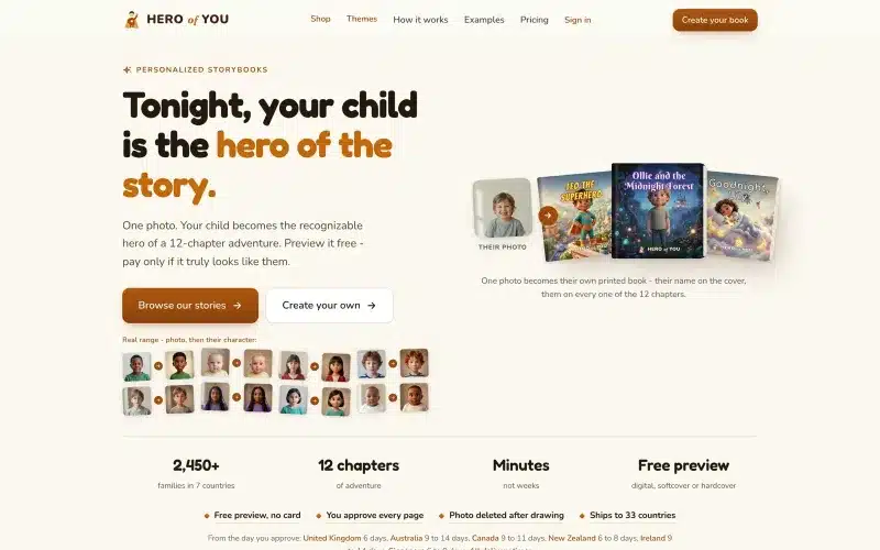 From our workProduct design people finishIn Hero of You a parent goes from a photo of their child to a printed book in one order.Product design →
Social Proof – Above the Fold
Logos of known customers.
“Trusted by 500+ companies” with specific number.
Star rating from G2 or similar.
User count if impressive.
Problem Statement
Acknowledge pain your visitor has.
Specific, not generic.
Language they use, not your jargon.
Example: “Reconciling invoices manually costs 15 hours weekly”.
Solution – Show, Don’t Just Tell
Product screenshots. Real ones, not stock.
Short video (30-60s) walking through key feature.
Interactive demo if possible.
Multiple screenshots for multiple features.
Features Section
3-6 key features maximum.
Icon + heading + short description.
Focus on outcomes, not features.
“Save 15 hours per week” > “Automated reconciliation”.
How It Works
3-4 step process.
Visual timeline or numbered list.
Reduces perceived complexity.
Builds confidence in implementation.
Testimonials
Real people with real names, titles, companies.
Photos where possible.
Specific outcomes: “Reduced our processing time by 60%”.
Not: “Great product!” – too vague.
Case Studies
Detailed customer success stories.
Problem → solution → outcome format.
Metrics and numbers.
Link to full case study for interested.
Objection Handling
FAQ section addresses common concerns.
Not sales-speak. Direct answers.
“How is this different from [competitor]?”
“How long does implementation take?”
“What if we need custom integration?”
Pricing Transparency
Show pricing when possible.
Multiple tiers with clear differences.
Enterprise: “Contact us” acceptable.
No prices: signals expensive or hiding something.
Multiple CTAs
Different intent levels:
Learn more (educational content).
Get demo (mid-funnel).
Start free trial (bottom of funnel).
Talk to sales (enterprise).
Sticky CTA
Always visible as user scrolls.
Primary action easy to access.
Mobile: fixed to bottom bar.
Desktop: sticky header or sidebar.
Lead Capture Form
Minimize fields: name, work email, company.
Optional: role, company size (for lead scoring).
Don’t require phone unless essential.
Progressive profiling: get more later.
Trust Signals
Security certifications: SOC 2, ISO 27001.
Compliance: GDPR, HIPAA.
Awards and press mentions.
Money-back guarantee.
Copy Length
B2B pages can be longer than B2C.
Different visitor types need different depths.
Scanners: bullets, headings, images.
Researchers: detailed content.
Provide both.
Visual Hierarchy
Most important element largest.
Clear reading order top to bottom.
White space to breathe.
Not cluttered.
Mobile Design
Increasing % of B2B research on mobile.
Not just responsive – designed for mobile.
Forms simplified.
CTAs thumb-reachable.
Performance
Fast load = higher conversion.
Under 2 seconds ideal.
Optimize images heavily.
Defer non-critical resources.
A/B Testing
Test one element at a time.
Headlines are highest impact.
CTA button copy and color.
Form fields (fewer = higher conversion usually).
Based on Real Projects
This guide is based on our work with:
Further Reading
If this guide helped you, you might also want to read our comprehensive guide on UI/UX Design.
Want to talk about your project?
A free consultation call, no commitment.
רוצים לדבר על הפרויקט שלכם?
אנחנו מתמחים בפיתוח SaaS, פתרונות AI, עיצוב UX/UI ובניית אתרים. ספרו לנו מה אתם צריכים.
דברו איתנו ←